
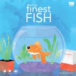
Designer Diary: The Finest Fish
by Nathan Jenne
/pic7185249.jpg)
When Jake and I sat down to design what resulted in The Finest Fish, we wanted to design something beautiful and we wanted it to be a tile-placement game. Surprisingly, we stuck to those goals! Frequently, once we start designing a game, we run into roadblocks or have amazing new ideas and completely depart from the initial idea that started the whole process. This time everything just clicked into place, and we stuck with the original concept.
Jake really liked the idea that the tiles could be shapes other than squares, rectangles, or hexagons. We started brainstorming. Ideas that were brought up included tessellations, feathers, peacocks, fish, and others.
We cut out shapes and started experimenting. Believe it or not, we started with feathers on a peacock. We made it pretty far through game development using peacock feathers…but it didn’t feel like there was a natural ending to the feathers. It seemed they could just expand forever with no bounds. Furthermore, we weren’t completely in love with our peacocks as they didn’t seem to have that cute factor that we wanted in this game.
At length, we settled on fish scales. Scales felt right. Fish felt right. Goldfish are relatable, and they feel serene.
We wanted players to earn points from groups of adjacent colors, but we knew the design needed more than that, so we added pattern cards as goals. These pattern cards added internal conflict to a player’s choices as we intentionally made them somewhat at odds with creating groups of the same colors. We loved it!
/pic7981489.jpg)
Additionally, we added a bonus color — red — that never appears on the pattern cards, but is always worth 1 point per scale and can still score in groups of three or more. After doing more research, we discovered that “calico” patterning on a fish was a desirable trait in prize goldfish, so we realized that we should make the bonus scale black instead.
We also wanted the game to have a pleasant color palette. Our first game, Life of a Chameleon, has many vivid colors, which can be jarring to some. While we love those vivid colors, we wanted something to match the calming feeling of watching fish and the casual feel of the game play.
/pic8082348.jpg)
Jake set to work illustrating the box and created four amazing unique fish. We love the art and have received so many positive comments about how they look.
Designing this game came with a lot of challenges. We also had a lot of fun working on it and playing this light, casual, fun game. It was all that we hoped it would be.
/pic8082349.jpg)
